8.2 POPULATIONS
![]()
INTRODUCTION |
Computer simulations are often used to make predictions about the behavior of a system in the future, based on time observation or a certain time span in the recent past. Such predictions can be of great strategic significance and can prompt us, for example, to rethink early enough in a scenario leading to a catastrophe. Hot topics today are the prediction of the global climate and population growth. We understand a population as a system of individuals whose number changes as a result of internal mechanisms, interactions, and external influences over the course of time. If external influences are disregarded, we speak of a closed system. For many populations the change in population size is proportional to the current size of the population. The change of the current value is calculated from the growth rate as follows: new value - old value = old value * growth rate * time interval Because the left shows the difference of the new value from the old value, this relationship is called a difference equation. The growth rate can also be interpreted as an increase probability per individual and time unit. If it is negative, it decreases the size of the population. The growth rate may well change over the course of time.
|
EXPONENTIAL GROWTH |
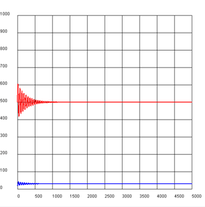
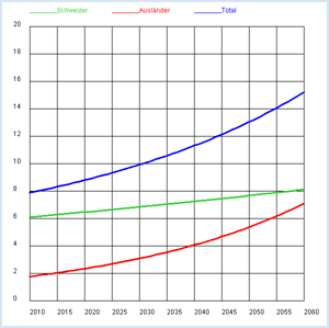
Population projections are of great interest and can massively affect the political decision-making process. The latest example is that of the debate going on about the regulation of the proportion of foreigners in the population. You can find the number of inhabitants in Switzerland each year for the years 2010 and 2011 from the Swiss Federal Statistical Office (source:: http://www.bfs.admin.ch, keyword: STAT-TAB):2010: Total z0 = 7 870 134, of which s0 = 6 103 857 are Swiss Can you create a forecast of the proportion of foreigners for the next 50 years from this information? You should first calculate the number of foreigners using the numbers a0 = z0 - s0 and a1 = z1 - s0 and from this the annual growth rate between 2010 and 2011 for Swiss and foreigners.
from gpanel import *

# source: Swiss Federal Statistical Office, STAT-TAB
z2010 = 7870134 # Total 2010
z2011 = 7954662 # Total 2011
s2010 = 6103857 # Swiss 2010
s2011 = 6138668 # Swiss 2011

def drawGrid():
    # Horizontal
    for i in range(11):
        y = 2000000 * i
        line(0, y, 50, y)
        text(-3, y, str(2 * i))
    # Vertical
    for k in range(11):
        x = 5 * k
        line(x, 0, x, 20000000)
        text(x, -1000000, str(int(x + 2010)))

def drawLegend():
    setColor("lime green")
    y = 21000000
    move(0, y)
    draw(5, y)
    text("Swiss")
    setColor("red")
    move(15, y)
    draw(20, y)
    text("foreigner")
    setColor("blue")
    move(30, y)
    draw(35, y)
    text("Total")

makeGPanel(-5, 55, -2000000, 22000000)
title("Population growth extended")
drawGrid()
drawLegend()

a2010 = z2010 - s2010 # foreigners 2010
a2011 = z2011 - s2011 # foreigners 2011

lineWidth(3)
setColor("blue")
line(0, z2010, 1, z2011)
setColor("lime green")
line(0, s2010, 1, s2011)
setColor("red")
line(0, a2010, 1, a2011)

rs = (s2011 - s2010) / s2010  # Swiss growth rate
ra = (a2011 - a2010) / a2010  # foreigners growth rate

# iteration
s = s2011
a = a2011
z = s + a
sOld = s
aOld = a
zOld = z
for i in range(0, 49):
    s = s + rs * s  # model assumptions
    a = a + ra * a  # model assumptions
    z = s + a
    setColor("blue")
    line(i + 1, zOld, i + 2, z)
    setColor("lime green")
    line(i + 1, sOld, i + 2, s)
    setColor("red")
    line(i + 1, aOld, i + 2, a)
    zOld = z
    sOld = s
    aOld = a
|
MEMO |
|
As you can gather from the figures, the proportion of foreigners doubles from 2010 to 2035, so just within 25 years, and in another 25 years it quadruples. With a the constant growth rate the population size obviously increases much faster than proportionally. If T is the doubling time, the population size y after time t for an initial size A is apparently:
Since time is in the exponent, this rapid growth is called an exponential growth. |
LIMITED GROWTH |
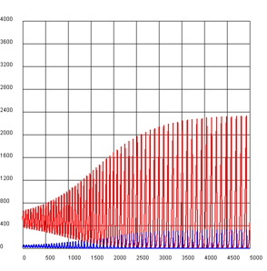
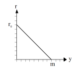
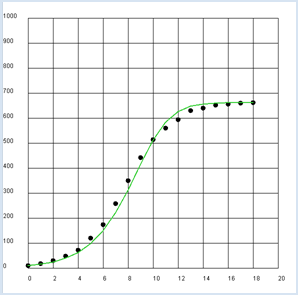
You can understand the experimental process with a model where the exponential growth experiences saturation. For this you can let the growth rate decrease linearly with an increasing population size y until it is zero at a certain saturation value m.
Using the initial value y0 = 9.6 mg, the saturation quantity m = 662 mg and the initial growth rate r0 = 0.62 /h we obtain a good correlation between theory and experiment. from gpanel import * z = [9.6, 18.3, 29.0, 47.2, 71.1, 119.1, 174.6, 257.3, 350.7, 441.0, 513.3, 559.7, 594.8, 629.4, 640.8, 651.1, 655.9, 659.6, 661.8] def r(y): return r0 * (1 - y / m) r0 = 0.62 y = 9.6 m = 662 makeGPanel(-2, 22, -100, 1100) title("Bacterial growth") drawGrid(0, 20, 0, 1000) lineWidth(2) for n in range(0, 19): move(n, z[n]) setColor("black") fillCircle(0.2) if n > 0: dy = y * r(y) yNew = y + dy setColor("lime green") line(n - 1, y, n, yNew) y = yNew
|

MEMO |
|
Assuming a linear decrease of the growth rate results in an “S” shaped saturation curve typical of the population size (also called logistic growth or sigmoid curve). |
LIFE TABLES |
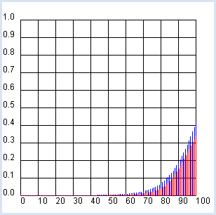
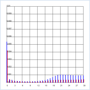
A possible way to measure the health of a population is to look at the probability of surviving a certain age or of dying at an old age, respectively. If you wish to analyze the age distribution of the Swiss population, you can use current data from the Federal Statistical Office again, namely the so-called life tables (source: http://www.bfs.admin.ch, keyword: STAT-TAB).
These tables contain the observed probabilities (qx and qy) for men and women to die at a certain age, separated by gender. Their determination is basically simple: one considers all deaths in the past year separately for men and women and calculates the frequency of 0-year-olds (people who died between birth and one year of age), 1-year-olds, etc. Afterwards, one divides each number by the total number in the corresponding age group at the beginning of the year.
import exceptions
from gpanel import *

def readData(filename):
    table = []
    fData = open(filename)

    while True:
        line = fData.readline().replace(" ", "").replace("'", "")
        if line == "":
            break
        line = line[:-1] # remove trailing \n
        try:
            q = float(line)
        except exceptions.ValueError:
           break
        table.append(q)
    fData.close()
    return table

makeGPanel(-10, 110, -0.1, 1.1)
title("Mortality probability (blue -> male, red  -> female)")
drawGrid(0, 100, 0, 1.0)
qx = readData("qx.dat")
qy = readData("qy.dat")
for t in range(101):
    setColor("blue")
    p = qx[t]
    line(t, 0, t, p)
    setColor("red")
    q = qy[t]
    line(t + 0.2, 0, t + 0.2, q)
|
MEMO |
|
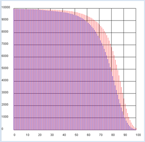
TEMPORAL EVOLUTION OF A POPULATION |
import exceptions from gpanel import * n = 10000 # size of the population def readData(filename): table = [] fData = open(filename) while True: line = fData.readline().replace(" ", "").replace("'", "") if line == "": break line = line[:-1] # remove trailing \n try: q = float(line) except exceptions.ValueError: break table.append(q) fData.close() return table makeGPanel(-10, 110, -1000, 11000) title("Population behavior/predictions (blue -> male, red -> female)") drawGrid(0, 100, 0, 10000) qx = readData("qx.dat") qy = readData("qy.dat") x = n # males y = n # females for t in range(101): setColor("blue") rx = qx[t] x = x - x * rx line(t, 0, t, x) setColor("red") ry = qy[t] y = y - y * ry line(t + 0.2, 0, t + 0.2, y) |
LIFE EXPECTANCY OF WOMEN AND MEN |
In the previous analysis it became clear once again that women live longer than men. You can also express this difference with a single quantity called the life expectancy. This is the average achieved age of either women or men. Briefly recall how an average, for example the average grade of a school class, is defined: You calculate the sum s of the grades of all students and divide it by the number of students n. If you are looking for simplicity, you can assume that only the integer grades between 1-6 occur and so you can calculate s as follows: s = number of students with the grade 1 * 1 + number of students with the grade 2 * 2 + ... number of students with the grade 6 * 6 or more generally: average = sum of (frequency of the value * value) divided by the total number If you read the frequencies from a frequency distribution h of the values x (in this case, the grades 1 to 6), one also calls the average the expected value and you can write
As you can see, the frequencie hi are weighted with their value xi in the sum. Life expectancy is nothing else than the expected value for the age at which women and men die. In order to calculate it with a computer simulation, you begin with a certain amount of men and women (n = 10000) and determine the number of men (hx) or women (hy) that die between the ages t and t + 1. Evidently these numbers can be expressed as follows, using the size of the population x and y at the time t which you calculated in the previous program and the death rates rx and ry: hx = x * rx bzw. hy = y * ry
n = 10000 # size of the population def readData(filename): table = [] fData = open(filename) while True: line = fData.readline().replace(" ", "") if line == "": break line = line[:-1] # remove trailing \n try: q = float(line) except exceptions.ValueError: break table.append(q) fData.close() return table qx = readData("qx.dat") qy = readData("qy.dat") x = n y = n xSum = 0 ySum = 0 for t in range(101): rx = qx[t] x = x - x * rx mx = x * rx # male deaths xSum = xSum + mx * t # male sum ry = qy[t] y = y - y * ry my = y * ry # female deaths ySum = ySum + my * t # female sum print "Male life expectancy:", xSum / 10000 print "Female life expectancy:", ySum / 10000 The data of the Swiss population yields a life expectancy of men of about 76 years of women about 81 years. |
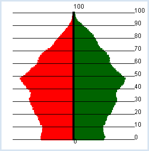
POPULATION PYRAMID |
import exceptions
from gpanel import *

def readData(filename):
    table = []
    fData = open(filename)
    while True:
        line = fData.readline().replace(" ", "").replace("'", "")
        if line == "":
            break
        line = line[:-1] # remove trailing \n
        try:
            q = float(line)
        except exceptions.ValueError:
           break
        table.append(q)
    fData.close()
    return table

def drawAxis():
    text(0, -3, "0")
    line(0, 0, 0, 100)
    text(0, 103, "100")

makeGPanel(-100000, 100000, -10, 110)
title("Population pyramid (green -> male, red ->  female)")
lineWidth(4)
zx = readData("zx.dat")
zy = readData("zy.dat")
for t in range(101):
    setColor("red")
    x = zx[t]
    line(0, t, -x, t)
    setColor("darkgreen")
    y = zy[t]
    line(0, t, y, t)
setColor("black")
drawAxis()
|
MEMO |
|
It is easy to spot the baby boomers born in the years 1955 – 1965 (47 - 57 years old). |
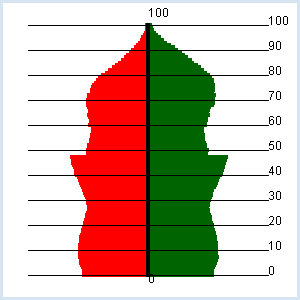
CHANGE OF THE AGE DISTRIBUTION |
With a key press you can show the following year. import exceptions from gpanel import * k = 2.0 def readData(filename): table = [] fData = open(filename) while True: line = fData.readline().replace(" ", "").replace("'", "") if line == "": break line = line[:-1] # remove trailing \n try: q = float(line) except exceptions.ValueError: break table.append(q) fData.close() return table def drawAxis(): text(0, -3, "0") line(0, 0, 0, 100) text(0, 103, "100") lineWidth(1) for y in range(11): line(-80000, 10* y, 80000, 10 * y) text(str(10 * y)) def drawPyramid(): clear() title("Number of children: " + str(k) + ", year: " + str(year) + ", total population: " + str(getTotal())) lineWidth(4) for t in range(101): setColor("red") x = zx[t] line(0, t, -x, t) setColor("darkgreen") y = zy[t] line(0, t, y, t) setColor("black") drawAxis() repaint() def getTotal(): total = 0 for t in range(101): total += zx[t] + zy[t] return int(total) def updatePop(): global zx, zy zxnew = [0] * 110 zynew = [0] * 110 # getting older and dying for t in range(101): zxnew[t + 1] = zx[t] - zx[t] * qx[t] zynew[t + 1] = zy[t] - zy[t] * qy[t] # making a baby r = k / 20 nbMother = 0 for t in range(20, 40): nbMother += zy[t] zxnew[0] = r / 2 * nbMother zynew[0] = zxnew[0] zx = zxnew zy = zynew makeGPanel(-100000, 100000, -10, 110) zx = readData("zx.dat") zy = readData("zy.dat") qx = readData("qx.dat") qy = readData("qy.dat") year = 2012 enableRepaint(False) while True: drawPyramid() getKeyWait() year += 1 updatePop()
|
MEMO |
|
It turns out that the future of the population is very sensitively dependent on the number k. Even with the value k = 2, the population decreases in the long term. To stop the screen from flickering when you press a key, you should disable automatic rendering with enableRepaint(False). In drawPyramid() the graphics are then merely deleted from the backing storage (offscreen buffer), and are only newly rendered to the screen after the recalculation of repaint(). |
EXERCISES |
|
ADDITIONAL MATERIAL |
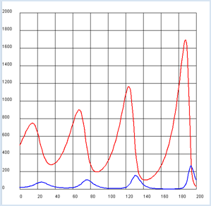
PREDATOR-PREY SYSTEMS |
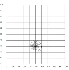
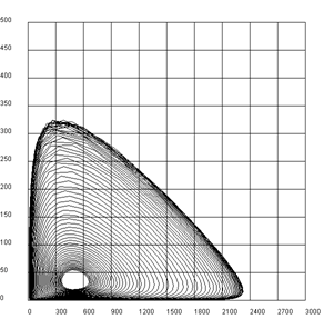
The behavior of two populations in a particular ecosystem which affect each other is very interesting. Assume the following scenario: If you assume that the probability of the foxes and bunnies meeting is equal to the product of the number of bunnies x and foxes y, there are two difference equations for x and y [more... These equations are the mathematical formulation of the Lotka-Volterra rules].
from gpanel import *

rx = 0.08
ry = 0.2
gx = 0.002
gy = 0.0004

def dx():
    return rx * x - gx * x * y

def dy():
    return -ry * y + gy * x * y

x = 500
y = 20

makeGPanel(-20, 220, -200, 2200)
title("Predator-Prey system (red: bunnies, blue: foxes)")
drawGrid(0, 200, 0, 2000)
lineWidth(2)
for n in range(200):
    xNew = x + dx()
    yNew = y + dy()
    setColor("red")
    line(n, x, n + 1, xNew)
    setColor("blue")
    line(n, y, n + 1, yNew)
    x = xNew
    y = yNew
|
MEMO |
|
The number of the bunnies and foxes consistently fluctuates up and down. Qualitatively, this cycle is understood as follows: since the foxes eat the bunnies, they multiply particularly strongly, when there are many bunnies. Since this in turn depletes the population of the bunnies, the breeding of foxes slows down. It is during this time that the number of bunnies increases again (even beyond any limits). |
EXERCISES |
|